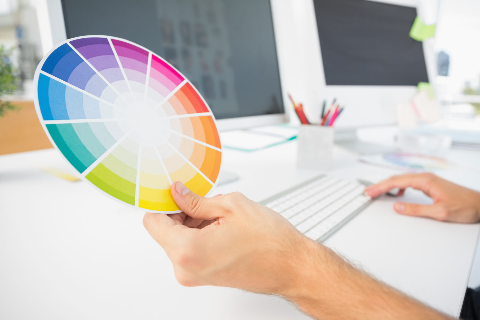
Importance of Colors
Before choosing a color palette for your brand, you have to know what each color represents and the feelings they can attract. Below are a few color facts for you. Reversed Out, when designing logos and brands, uses these color basics to help convey the right message for your business.
Red
The color red is associated with a variety of things, including: danger, strength, power, determination, passion, desire, and love. It has very high visibility, which is why stop signs, stoplights, and fire equipment are usually painted red. Usually, brands will use the color red to make their words and images stand out. It also represents a feeling of energy, so brands promoting sports or any other physical activity will typically use red somewhere in their marketing.
Orange
The color orange is associated with enthusiasm, fascination, happiness, creativity, determination, attraction, success, encouragement, and stimulation. Like the color red, orange has high visibility, so you can use it to catch attention and highlight the most important elements of your design as well. Usually, orange is effective for brands promoting food products and toys because younger people are more drawn to it.
Yellow
The color yellow is associated with joy, happiness, intellect, and energy. It’s very effective for attracting attention, so use it to highlight the most important elements of your design. Yellow is typically used to bring up happy and cheerful feelings and is also used a lot in food marketing. However, it is considered to be an unstable and spontaneous color, so avoid using yellow if you want your brand to suggest stability and safety.
Green
The color green is associated with nature, growth, money, harmony, safety, freshness, and fertility. Green is a color that’s usually seen representing safety because it suggests stability and endurance. This is why companies typically use green to indicate safety when advertising drugs and medical products.
Blue
The color blue is associated with depth, stability, trust, loyalty, wisdom, confidence, intelligence, faith, truth, tranquility and calmness. When used together with warm colors such as yellow or red, blue can stand out and create vibrant designs. You can use blue to promote products and services related to cleanliness, air and sky, water or seas. However, avoid using blue when promoting food and cooking, because it suppresses appetite.
Purple
The color purple is associated with royalty, wisdom, dignity, power, nobility, luxury, independence, creativity, mystery, and magic.
It combines the stability of blue and the energy of red. Brands promoting high end or luxurious products are likely to use purple. It’s important to note that light purple brings up a feeling of nostalgia, where as darker purples can bring out feelings of frustration.
Black
The color black is associated with power, elegance, formality, fear, death, evil, and mystery. Black contrasts really well with brighter colors like yellow or orange. It is thought of as a formal color and is usually used in fancier high end brands.
White
The color white is associated with light, goodness, innocence, perfection, cleanliness and purity. In advertising, white is usually associated with coolness and cleanliness and brands use it to suggest simplicity.
Now take a minute and think about brands that apply multiple colors to their brand and how the combination helps convey the company message.
Not sure where to start? Reversed Out designers love working on logos and brand design. Take a look at some of our favorites.
Contact Us
At Reversed Out Creative, we understand the challenges and opportunities presented by AI disruption. Our team of experts specializes in web design, SEO, graphic design, and digital marketing services. Reach out to us through our contact form to learn more about navigating the evolving job market and embracing the potential of AI. Together, let’s shape a future that combines human ingenuity with the power of AI.
Next Article: Five Signs Your Website is Outdated
Subscribe To Our Newsletter.
Conquer your day with daily search marketing news.
Unlock Exclusive Strategies with our Free whitepaper!
Subscribe to Our Newsletter and Get Access to Expert Insights, Tips, and the Latest Marketing Trends. And get the free whitepaper “A Guide for Multi-Taskers: Top 10 Marketing Strategies for Professionals Wearing Many Hats”
©2024 Reversed Out LLC. All rights reserved. Privacy Policy.