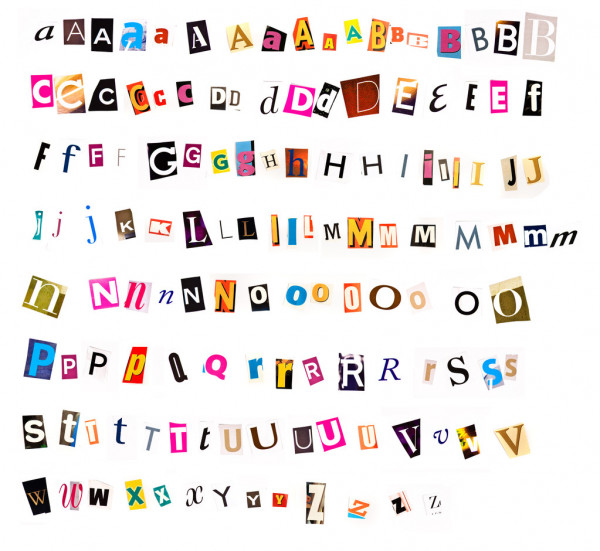
Fonts play a more important role in your brand logo than you may realize. Each font type has a personality and aesthetic, and if these don’t match with your brand, then there will be a huge gap between your logo and what your brand is really about.
At Reversed Out Creative, an ad agency in Covington KY, we have helped a number of brands design their brand logos. From our experience, we have realized that it is best to avoid these fonts when creating a brand logo:
Comic Sans
As the name suggests, Comic Sans is a font that was inspired by comic books, which explains its informal and childish appearance. Its lack of formality makes it unsuitable for brands that want to look legitimate and established. In other words, it is difficult to take a brand seriously if their logo has a Comic Sans font.
Bradley Hand
Bradley Hand is a ‘handwritten’ font that is commonly used in party invitations, school posters, announcements, etc., because of its warm and informal personality. These are the main reasons why this font is not ideal for brand logo design as well. The font has also been overused, which makes it appear dull and inexpensive.
Helvetica
Helvetica is a clean and simple font, but the truth is that it is more ideal for ordinary content than it is for a brand logo design. Sure, many big companies use this font for their logo because it is clear and easy to read, but it doesn’t really stand out as a font if you are not a brand that is already popular and easily identifiable.
Franklin Gothic
You may think that Franklin Gothic is a great font to use if you want to go for a classic brand logo. However, it has been misused way too often by designers who don’t really know what they are doing. It has the potential to look good, but only when used in the right context and with the right elements.
Papyrus
Papyrus is a font that has been used everywhere. It is one of those fonts that has been used way too often that it has lost its value. It is not really suitable for a brand logo design since it has a rather childish, kitschy personality. This makes it difficult to take a brand seriously.
Curlz Mt
Another font you should avoid if you want to be perceived as an established and respected brand is Curlz Mt. This font is very decorative and childish, can be illegible at times, and lacks any kind of formality and authority.
Kristen ITC
The Kristin ITC font almost looks similar to the Comic Sans font but is more rounded. This font was designed so it could be used to target the market that makes products for kids. It looks unprofessional, and would not be taken seriously when used to design a brand logo.
Choosing the right font that accurately reflects your brand is critical while designing your logo. Reversed Out Creative has an expert team that can help choose the right font for your business. Contact us to find out more!
Contact Us
At Reversed Out Creative, we understand the challenges and opportunities presented by AI disruption. Our team of experts specializes in web design, SEO, graphic design, and digital marketing services. Reach out to us through our contact form to learn more about navigating the evolving job market and embracing the potential of AI. Together, let’s shape a future that combines human ingenuity with the power of AI.
Next Article: Your Guide to Creating Motion Graphics That Convert
Subscribe To Our Newsletter.
Conquer your day with daily search marketing news.
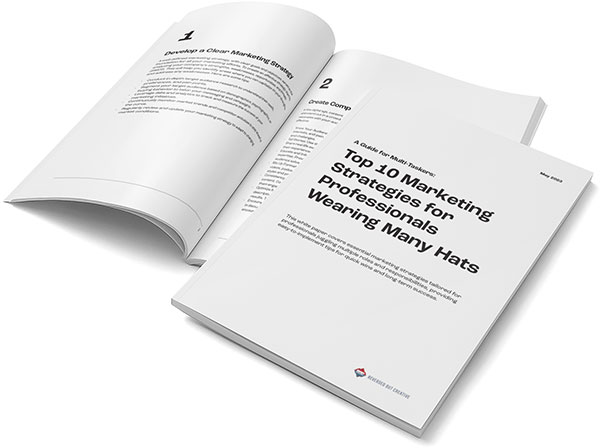
Unlock Exclusive Strategies with our Free whitepaper!
Subscribe to Our Newsletter and Get Access to Expert Insights, Tips, and the Latest Marketing Trends. And get the free whitepaper “A Guide for Multi-Taskers: Top 10 Marketing Strategies for Professionals Wearing Many Hats”
©2024 Reversed Out LLC. All rights reserved. Privacy Policy.