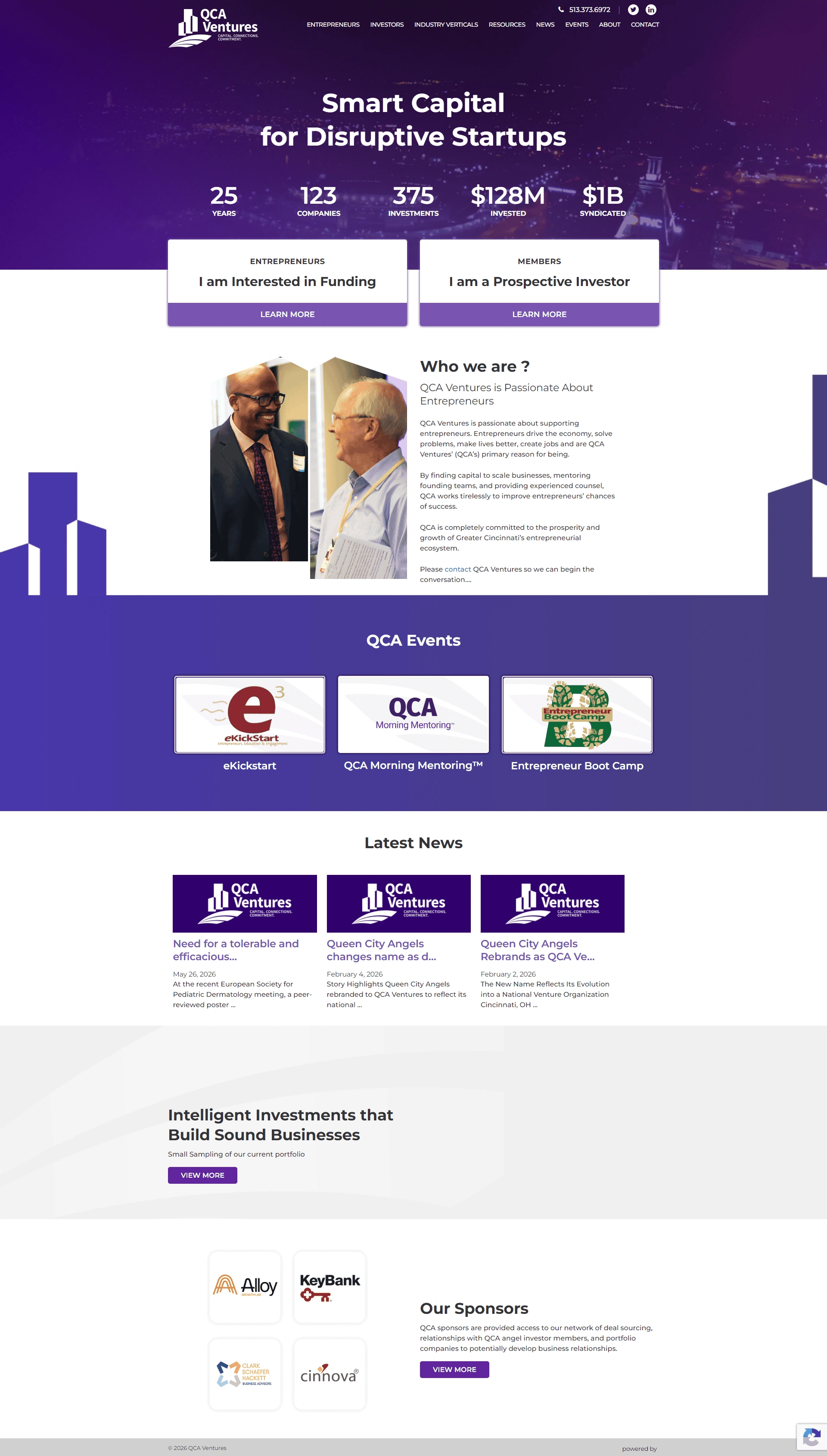
After more than two decades operating as Queen City Angels, the organization was ready for a new chapter.
The leadership team recognized that the organization had evolved beyond its original identity and needed a brand capable of supporting a broader vision for the future.
However, changing the name of a 25-year-old investment organization involves far more than creating a new logo.
The challenge was maintaining institutional continuity while modernizing every aspect of the organization’s public and internal identity.
Critical considerations included:
The objective was not simply to rebrand the organization.
The objective was to ensure the organization felt more modern without losing the trust and history that had been built over decades.

Venture Capital, Angel Investing & Economic Development
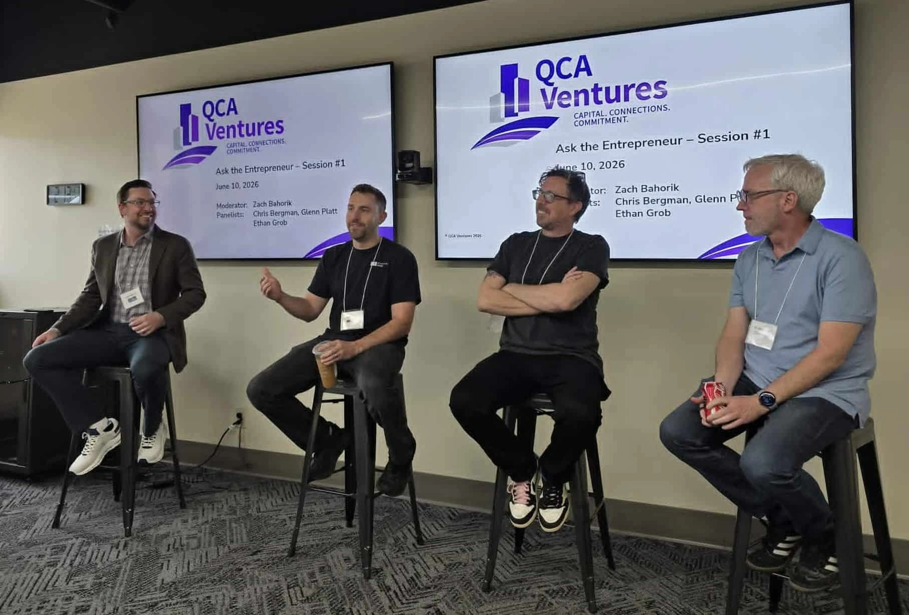
Reversed Out served as the strategic implementation partner responsible for managing the transition across both physical and digital environments.
The rebrand extended beyond visual identity.
We helped create a framework for how the new organization would present itself across every stakeholder touchpoint.
This included:
The goal was creating a cohesive experience regardless of where members encountered the brand.
Some of the most important work occurred behind the scenes.
We redesigned and updated foundational organizational documents, including:
Rather than simply replacing logos, we restructured layouts, improved readability, modernized formatting, and strengthened overall presentation quality.
To ensure consistency across leadership, staff, and members, we developed standardized communication tools.
These included:
This helped eliminate inconsistencies that often emerge following major rebranding efforts.
We also modernized digital brand experiences.
Projects included:
Special attention was given to compatibility across commonly used business platforms, ensuring assets functioned reliably in real-world environments.
The transition required updating a wide range of physical materials.
This included:
By coordinating both digital and physical assets simultaneously, we ensured the new identity launched consistently across all channels.
By establishing clear standards and updated templates, staff and leadership no longer needed to navigate multiple versions of logos, fonts, presentations, or legacy materials.
Most importantly, the organization gained a modern identity system capable of supporting future growth while respecting the legacy that had been built over more than two decades.