Companies are becoming increasingly conscious that they need to follow a mobile strategy. Not only has the number of mobile-only internet users exceeded desktop-only, but the usage of apps has also exceeded the usage of desktops. Despite this change, companies are rethinking their mobile strategies. However, the biggest problem they may face is whether a mobile app or a mobile website is the best way to go.
Many claim that you don’t need a mobile app; just a website that looks nice on mobile devices is required. Others say smartphones have benefits a website can’t offer. However, there is a multitude of considerations when digging a little deeper before making a decision. When it comes to different mobile media, it can be hard to figure out where to focus your efforts. We will break down the pros and cons of each choice, allowing you to align a mobile strategy that fits your business goals.
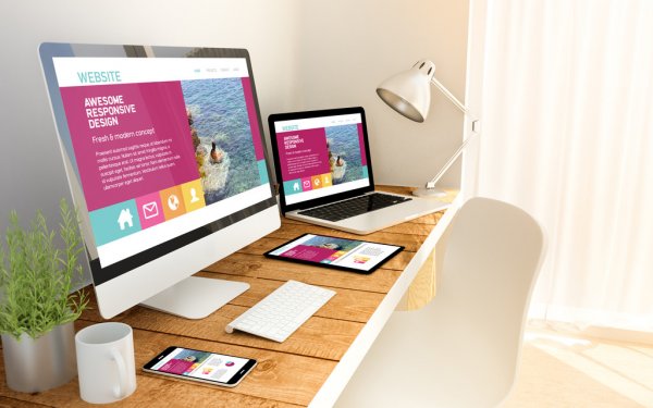
Perhaps the most common misconception we hear about mobile websites is that their regular or “desktop” websites are just smaller versions. (The online site is the one you’re used to using on your laptop or home desktop computer, where you’re using a mouse to move through a more comprehensive page with a big video monitor.)
Now, get out your mobile device and start browsing through your smartphone to any number of websites – maybe even your own. If what you see is a small, illegible version of your regular website or if you have to use your fingers to expand what you see on the screen, you’re just watching your smartphone over a desktop website. It is not a mobile website.
Unlike the small text, cumbersome graphics, and navigation experience that you have on your smartphone with a desktop website, a mobile website is specifically designed and scaled to work beautifully on tiny smartphone screens. Since smartphone users are interested in vital decision-making details right now while using their phones to find out about your store or company, a mobile website gets rid of clunkiness and poor visibility. It gets down to the brass tacks — using larger and easier-to-read fonts and graphics in a smaller format. Some features which distinguish mobile website designs from desktop websites include:
Mobile app users’ endurance threshold is diminishing daily, but it was never more than a few seconds to get going. The vast majority of users of smartphones and mobile devices will abandon a non-mobile, optimized website in milliseconds in favor of a mobile-optimized website. It is true even though they are already a client and like your products!
Does that mean how many potential customers and profits you will lose to the competition if your website is not mobile? More people are browsing the web from their mobile devices for product and service details than they ever have from their desktop computers. Undertakings can no longer neglect the internet revolution.
Of course, personal computers, laptops, and the need for proper mobile web design won’t go away anytime soon — and with all the publicity, they’ll probably never go away entirely. Ios is, however, the surfing platform of choice for the masses, and your company website needs to be ready.
This means we create websites that adapt to the computer on which they are being used. If a customer surfs your site from a desktop computer, they will see the great, fully-featured website, that so many are used to.
If they surf from their smartphone, they’ll see a mobile-optimized website on their small screen that’s easy to use, loads quickly over cellular networks and gives them the vital details they need to buy what you’re selling right now!
From desktops to smartphones to an expanding galaxy of various connected screens and devices, we can safely say that access to the world’s on-demand information is now and for the foreseeable future, part of our lives. We’re at the end of a new beginning, and businesses have to evolve. People are now demanding connectivity wherever they are, and on any computer they want-this is the new norm. It is time for businesses to catch up and appreciate their related customers.
With mobile web browsing becoming more popular, developing websites for both mobile use and desktop use is becoming increasingly relevant. This can mean everything from modifying your daily site. Hence, it looks nice for mobile users on Android and iOS devices, to CSS media requests, responsive templates, and even completely different websites.
A smaller display means the users will be able to see much less information at once. Most modern mobile browsers make up for this by making it easy for the user to zoom in and out, as well as changing font sizes to make the text more decipherable. But, usually, if you want the text on your page to be optimized, the user would need to zoom in.
Also, a smaller display pushes more of your page content “below the fold,” which requires users to scroll more frequently through your page content.
So, for your site to perform well on a mobile browser, you need to: display essential information near the top of the page, use an easy-to-read font, and don’t overwhelm the user with too much material. Furthermore, the page layout must be available, and it must also look beautiful in a small browser window. This usually means a more straightforward layout of the page than you would find on a standard website.
While mobile devices are catching up, they typically have much less processing power than desktop computers. This is for different reasons, including cost and battery life. Mobile browsers, therefore, take longer to render pages, and JavaScript-intensive pages may run very slowly.
Consider designing a simpler page layout that uses less markup and CSS for mobile browsers. If your site uses a lot of JavaScript to do things like slideshows, interactive forms, and the like, you may want to customize or reduce your JavaScript, so it runs smoothly on mobile browsers.
While cellular network speeds are continually improving, a typical 4G mobile device is getting a download rate of 5-12 Mbps, compared to an average of over 50 Mbps for broadband internet users.
Most mobile plans, however, actively restrict the amount of data that can be downloaded per month. If your users notice that their site is eating up a big chunk of their download allowance, they won’t come back!
Having your site as bandwidth-efficient as possible is also a good idea because every second that your users have to wait for your pages to load will increase their annoyance.
If your website contains large graphics or embedded videos that take up a lot of bandwidth, then you certainly want to look at designing a sensitive, mobile-friendly site with smaller images as well as lower bit rate video (or no video at all). Even if you provide your guests with downloadable PDFs or other material, make sure that the file isn’t too big to download easily to a mobile device.
Touch-based feedback is one significant feature of many mobile apps. Instead of using a mouse, the vast majority of smartphone users use their fingers to work with their smartphones (some desktops do likewise). For mobile app designers, this has many consequences, including:
There’s no mouse pointer, so over a page element, there’s no concept of “hovering.” On touch apps, navigation menus, and other controls depending on the pseudo-class CSS hover or JavaScript mouse-over/mouse-out events won’t work well. Some mobile browsers use different tricks to make up for this, such as firing a hover event if the user taps the feature, and a click event if they tap again. It’s best, though, not to rely on hover events for the functionality of your mobile site.
Clicking with a mouse over a 12-pixel-high text connection is no problem. Tapping big “sausage” fingers on the same link is a different story! By zooming in, users can compensate for this, but it is still awkward. It is one of the best arguments for creating a separate site only for mobile users since you can then replace those fiddly text links with beautiful, large, touch-friendly buttons and other controls.
Most modern touch devices require the user to use one or more fingers to perform gestures, such as swiping, pinching, and so on. You can use gestures to help your mobile users enhance their experience. For example, you can let your users swipe between images in a gallery to switch left and right. Many JavaScript frameworks like jQuery Mobile are capable of generating events for different touch gestures, making it easier to add gesture support to your mobile sites.
If you’re using a full-size add-on keyboard for your mobile device, you’re likely to tap a sturdy little plastic keyboard or select a small on-screen keyboard. While these keyboards are much better than they used to be, they are still far from being a pleasant experience to type on. It means smartphone users are nasty about typing long text reams. Your mobile website can make their lives easier by:
• Allow use of shorter URLs
• The autocomplete function is applied to text fields and search fields
• Provides a simple way to browse famous pages or items, instead of searching
• Use as much information as possible in web-forms
Multitasking is finally beginning to take off on mobile devices, in the sense of being able to run more than one program at a time. That said, many computers can’t multitask yet, and even those that do, don’t give the multitasking desktop capacity or versatility.
This poor support for multitasking will affect how you build your mobile websites. For example, consider adding Twitter / Facebook sharing buttons on every page on your site so that users don’t have to copy and paste the URL on your page to a separate window or device to share it.
Users almost always surf the web in a browser on the desktop. However, devices consume 86 percent of the online mobile time, and web browsers only consume 14 percent.
This fact can have various subtle consequences for the design of your mobile site:
There is also no URL bar – this means that by looking at your page’s URL, copying and pasting the URL, or typing in a new URL, users can not gather any information or background.
Reduced screen real estate – Mobile browser views are tiny at best, but websites displayed in apps are frequently squeezed into even smaller spaces due to the page’s device toolbars, buttons, and other widgets.
Limited functionality – Typically, when viewing web pages within apps, browser features such as bookmarking, opening links in new windows, or printing is not provided.
Including sharing buttons within your pages can make sharing your content easier for users while inside another app. Don’t force people to rely on the meaning of your page’s URLs, either.
Have valuable information to help users with their orientation.
Most desktop displays have a landscape orientation; however, the opposite is of mobile devices- most users have a portrait orientation to their screen.
This mobile site trend that is well suited to a vertical orientation, resulting in design decisions such as:
It is probably one of the most critical overall discrepancies between a web interface on the smartphone and desktop. Most of the time, people are using their mobile devices differently than their computer, often for various tasks.
Users at their machines during:
• Lounging at a desk
• Very frequently in an office environment
• Working often
• Often, you browse the web at random
• Creating material
• Concentrated on the machine and not so much on their world
These differences affect site types that work well on mobile devices. For instance, websites and web apps that are designed to help people create content will generally become more popular on desktop computers. In contrast, sites that allow users to consume content easily, or find a specific piece of information while moving, will attract more mobile users.
Flash is almost ubiquitous on the internet, with the Flash player enabled by more than 90 percent of users. However, it’s a different story with the mobile network.
Flash does not run any iOS apps. Android devices that use version 2.2 or later can run Flash, but many users prefer to turn it off because it can cause problems with performance and stability. All in all, well under half of the world’s mobile devices are Flash-capable, and even if a device can run Flash, it’s usually not an enjoyable experience.
A website that relies on Flash will, therefore, not be popular with mobile devices. Fortunately, now there are ways to create a Flash-like experience for smartphone and desktop users without using Flash itself. Current web standards such as HTML5, CSS3, and SVG allow you to create vectors, animations, games, interactive elements, and embedded videos that will run well on all current mobile devices, whether Flash-enabled or not.
It is essential to keep those differences in mind when designing any website that will be viewed on mobile devices. By accommodating both the desktop and mobile in your website strategy, you can offer both of these audiences a great experience.
Whether you are the owner of a company or CEO, you have been thinking about how to attract this market and what mobile strategy to apply: whether to create a mobile version of a website or app. There is no definitive answer because the choice you select depends on a variety of factors, including your business plans, resources, and the web properties you may need.
We’ve built several projects either based on a mobile website or a native app (or both). To help you choose the best solution for your company, we would like to share our experience in this matter and bring out the advantages of the mobile version of the website and app as well as the drawbacks of each approach.
A website increases user experience across various types of mobile devices. In contrast, a mobile application requires that a separate version be developed for each type of operating system and device. Users who own devices of various types may particularly appreciate the benefits of accessibility that sensitive websites offer. Also, they support simple integration with other mobile apps such as QR codes and text messaging.
Because of the multi-device support that responsive web design offers across different platforms, accessing a wider audience is becoming more comfortable than a smartphone app would provide. The website is gaining in terms of potential audience in the “app vs. website” debate.
Upgrading websites also cost less. You just need to hold a single version of them. Compared to mobile apps that involve the installation of each update, responsive/mobile websites allow you to modify content or design by changing it once and enabling you to do so quickly and flexibly. Updates become active and instantly available across all types of devices following implementation.
Mobile-only websites have a broader scope, more excellent usability, and need fewer resources than mobile phones. Nevertheless, it has its limits.
Unlike an application, a responsive/mobile-only website cannot exploit the features of the smartphone as effectively as possible. Cameras, GPS, phone dialing, and other features built into mobile devices are not always well designed for responsive/mobile websites, given the recent introduction of APIs and libraries intended to help solve these problems.
Another disadvantage of user benefits is the screen size of a computer. Portability is, of course, the main reason why users are enjoying having smaller devices on the go. Mobile apps, however, display far less content than a computer monitor or laptop screen.
Both responsive design and mobile websites don’t wholly access all of the desktop content. While responsive web design adjusts dynamically to the screen size, it still does not make browsing the site on a mobile device entirely convenient for users. The same is true of the mobile website, which simply reduces and rearranges the content on the screen.
Since mobile experiences differ from desktop experiences, implementing the same interface for both platforms will harm your UX strategy. This mostly relates to the restriction for a single window. The single-window restriction says a user shouldn’t have to leave their current page to access all of the content they’re looking for; however, it’s often impossible to fit everything on one page with mobile sites.
Even if your mobile website is built in the lightest and most detailed way possible, cached pages will still operate offline with only minimal functionality. Unlike a mobile device, which can run locally, a mobile website needs a reliable internet connection for full service.
Unlike responsive/desktop websites that you can access through browsers, mobile apps need to be downloaded from similar platforms such as the Google Play Market, the App Store, or anther platform depending on the type of operating system.
Mobile devices deliver faster content access and smoother experiences. Many recent reports promote the use of smartphone devices for convenience. According to the 2016 survey conducted by Flurry Analytics, evaluating the time smartphone users spend browsing the internet, 90 percent of consumers prefer mobile websites to apps.
When it comes to particular business requirements, every day, situations occur when the best option is to create an application. For example, if you plan to set up apps linked to the functionality of native devices, such as GPS, click-to-call, cameras, or scanners, then an application would be more successful than a mobile website.
An excellent time to select an application is when you’re creating a platform such as a digital marketplace or a social network that requires access to various types of content (images, messages, music, and YouTube videos) and needs to keep all of these elements usable and interactive.
An application is also perfect for interactive games (Angry Birds), daily use tools (Evernote), and services that enable you to train and track progress in real-time, and to send regular reminders (FitBit, Duolingo).
A smartphone device is a great approach to data manipulation. When you need to process complex calculations and generate reports, such as in investment and banking, then using an app is also better.
A smartphone app will act as a perfect complement to a full website for banking operations and services. Banks (Bank of America, Raiffeisen) nail this idea by picking out the most popular desktop web features, which are essential for on-the-go use, and only putting those features into their applications, making them comfortable and convenient to use.
Of course, it’s essential to examine the key advantages of mobile apps as well as their disadvantages when determining if you need to create an application.
Mobile device use has been on the rise ever since Apple released the first smartphone, and mobile devices have become such a normal part of daily life that we all expect people to see their phones any time we leave home.
The change in how people communicate with the web isn’t shocking for website owners, but it does increase the urgency you need to create a mobile-friendly website. If your mobile visitors don’t have a pleasant experience at the moment when they land on your website, you drive away a considerable part of your potential traffic.
A sensitive website includes all the same content and information about every device on which you view it, but it adjusts the way it is presented and organized depending on the screen size. It is the perfect way to make your website mobile-friendly, since you don’t limit the details your mobile visitors can access – they can get the same content as the rest of your visitors. Also, SEO’s fantastic at responsive design, too. Google has said mobile websites are their favorite type.
Most people who search the web on their mobile devices don’t mind searching or reading content at the same speed as they would like on a computer, while others prefer to find the details they need as quickly and as conveniently as possible. Think about the information people are most likely to be looking for on mobile devices when they head to your website and put it on the mobile homepage somewhere that is obvious and easy to find.
Using Flash all over your website is an SEO error. It can slow down the load time of a website, and there are plenty of browsers and devices where it just doesn’t work at all. Neither Android nor iOS devices support flash, so if you’re creating a website that relies on a Flash animation experience in some way, your mobile users are left out. It’s best to scrap the technology entirely on your website at this stage and find a good web design that works without it.
The Meta tag viewport is an easy way to control how your website appears on the mobile. If your page opens up the same width on your phone’s tiny screen as it does on your laptop, you’ll have to swipe from side to side uncomfortably to read each line of text and see the various sides of the page. The meta tag on the viewport tells browsers to match the width of your page to the computer type screen from which the visitor comes.
Something easy not to think about is the little way autocorrect will make it more difficult for a user to communicate with your app. If you have on your website forms requesting name or address information, one small way you can make it easier for your mobile visitors is to disable autocorrect information for each form field, otherwise, their phone will try to change their name or street name to more common words and slow down the process of completing your form.
Subscribe to Our Newsletter and Get Access to Expert Insights, Tips, and the Latest Marketing Trends. And get the free whitepaper “A Guide for Multi-Taskers: Top 10 Marketing Strategies for Professionals Wearing Many Hats”
Coronavirus ( COVID 19 ) has infected more than 135,000 people and killed more than...
In this article, we are going to share the insights on Root Domain Vs Subdomain....